The Brief
Betfair Gaming Creative Identities
Betfair offers a range of different gaming products including Casino, Arcade, Bingo, Poker, and Exchange Games. The Gaming Branding helps to instil a feeling of family across these products but it is important that the creative style of each of the products is distinct so each product can stand on it’s own with a rich visual style.

Casino
The creative for Betfair Casino is in a modern/futuristic style. The style intentionally avoids wood, brass and typical casino imagery with the intention that the style doesn’t carry any negative connotations associated with gambling (drinking, smoking, darkened rooms, gambling…). The focus is on aspirational imagery and abstract representations of Casino products in a fresh way. Casino is energised, fresh, modern, light in tone with a sprinkle of futuristic technology. It is not a typical gambling look, nor male centric.

Arcade
With Betfair Arcade the intention was to create a fresh, colourful world with the focus on fun and excitement. Inspiration was drawn from the mobile games industry for the look and concentrated mostly on a vector approach. Arcade runs a lot of promotions and with short deadlines so it was important for a creative style that is agile. A vector approach served this well as a skilled designer can easily and quickly adapt stock vector to create striking visuals to support the promotions.

Exchange Games
Exchange Games had two approaches one was an “odd one out” where we have multiple objects with one being different (but better), this is to represent that Exchange Games is a different way of playing than people are used to. If you play Exchange Games you are different but possibly better. The second approach was a real world but top down view with the message being that you are seeing the world from a more complete angle and can see more than you could from ground level, this represents the way Exchange Games operates where you are playing conventional games but from a different angle. These two styles were later replaced with a more aspirational creative style where we use desaturated/black and white aspirational photography but colour one element of the creative with a strong Exchange Games green colour.

Poker
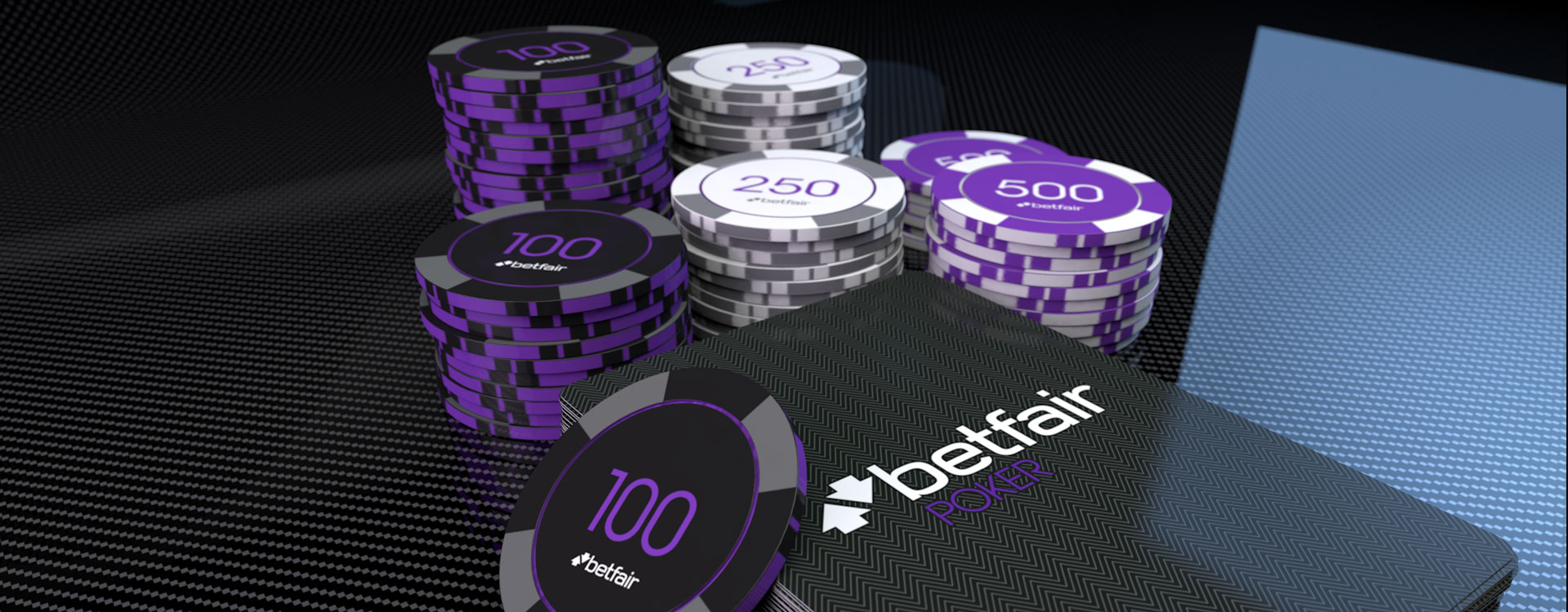
The main visual identity with Poker is the colour selection. The Poker purple colour is used for hero elements and then contrasting Betfair Carbons for the majority of the colour. The imagery is slick and cool with an aspirational slant. 3d creatives are also used with the same colour treatment. Poker is the darkest gaming product in tone, as Poker is perceived as a more serious product.

Bingo
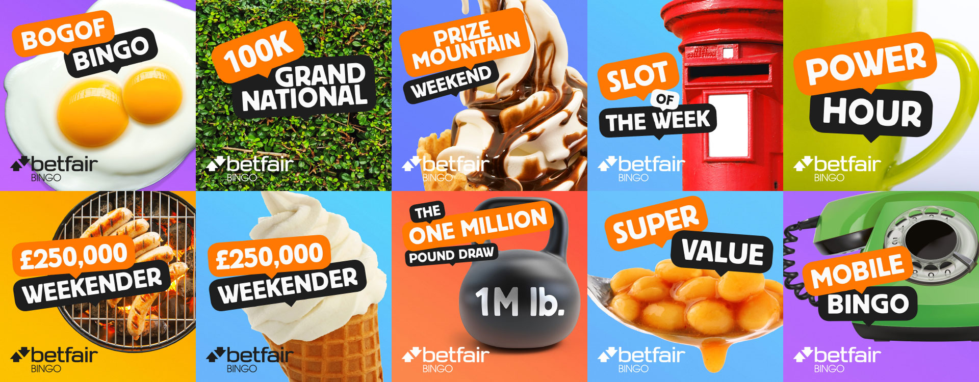
Bingo is a style with a very colourful background and a single hero element in the foreground. The hero element casts a shadow on the background otherwise it is a bold single space of colour. The hero element is a real world object that works with the theme of the promotion and can be quite abstract in concept but is a playful representation of the promotion. The Bingo creative is looking for a feeling of nostalgia, of play but for adults of both sexes, it can be quite silly.

